
File:Anscombe.svg
| |
This is a file from the Wikimedia Commons. Information from its description page there is shown below.
Commons is a freely licensed media file repository. You can help. |
Summary
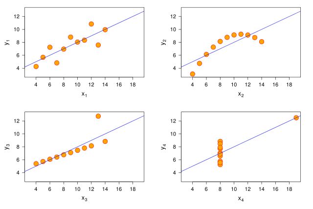
This graphic represents the four datasets defined by Francis Anscombe for which some of the usual statistical properties (mean, variance, correlation and regression line) are the same, even though the datasets are different.
| Property | Value |
|---|---|
Mean of each  variables variables |
9.0 |
| Variance of each variables |
11.0 |
Mean of each  variables variables |
7.5 |
| Variance of each variables |
4.12 |
| Correlation between each and variable |
0.816 |
| Regression line |  |
The graph was created by User:Schutz for Wikipedia on 13 June 2006 (and updated on 29 March 2010), using the R statistical project. The program that generated the graphic is given below; it is based on the example provided with the help page of the R dataset anscombe (accessible using the command data(anscombe)>; help and more information about the dataset is available using the command help(anscombe)), and was slightly modified to improve the result. The graph was directly exported in SVG format.
References:
- Anscombe, Francis J. (1973) Graphs in statistical analysis. American Statistician, 27, 17–21.
- R Development Core Team. R: A Language and Environment for Statistical Computing. R Foundation for Statistical Computing. Vienna, Austria. 2006. ISBN 3-900051-07-0. http://www.R-project.org
 svg("anscombe.svg", width=10.5, height=7)
 par(las=1)

 ##-- some "magic" to do the 4 regressions in a loop:
 ff <- y ~ x
 for(i in 1:4) {
   ff[2:3] <- lapply(paste(c("y","x"), i, sep=""), as.name)
   ## or   ff 2 <- as.name(paste("y", i, sep=""))
   ##      ff 3 <- as.name(paste("x", i, sep=""))
   assign(paste("lm.",i,sep=""), lmi <- lm(ff, data= anscombe))
 }

 ## Now, do what you should have done in the first place: PLOTS
 op <- par(mfrow=c(2,2), mar=1.5+c(4,3.5,0,1), oma=c(0,0,0,0),
           lab=c(6,6,7), cex.lab=1.5, cex.axis=1.3, mgp=c(3,1,0))
 for(i in 1:4) {
   ff[2:3] <- lapply(paste(c("y","x"), i, sep=""), as.name)
   plot(ff, data =anscombe, col="red", pch=21, bg = "orange", cex = 2.5,
        xlim=c(3,19), ylim=c(3,13),
        xlab=eval(substitute(expression(x[i]), list(i=i))),
        ylab=eval(substitute(expression(y[i]), list(i=i))))
   abline(get(paste("lm.",i,sep="")), col="blue")
 }

 dev.off()
|
|
This chart was created with R. |
Licensing
The R project is licensed under the GPL ; since this image is a derived work of an example script provided with R, it is also licenced under the GPL.
However, all modifications made by User:Schutz are also licensed under the CC-BY-SA licence.
 |
This work is free software; you can redistribute it and/or modify it under the terms of the GNU General Public License as published by the Free Software Foundation; either version 2 of the License, or any later version. This work is distributed in the hope that it will be useful, but without any warranty; without even the implied warranty of merchantability or fitness for a particular purpose. See version 2 and version 3 of the GNU General Public License for more details. |
Derivative works
Derivative works of this file:
File usage
Metadata
More information
Schools Wikipedia has made the best of Wikipedia available to students. Thanks to SOS Children's Villages, 62,000 children are enjoying a happy childhood, with a healthy, prosperous future ahead of them. Sponsoring a child is a great way to help children who need your support.