
File:Agricultural value map 1970-2008.gif
Size of this preview: 640 × 287 pixels.
| |
This is a file from the Wikimedia Commons. Information from its description page there is shown below.
Commons is a freely licensed media file repository. You can help. |
Contents |
Summary
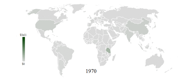
| Description |
English: Political world map shaded according to the agricultural portion of GDP for each country and spanning the years 1970-2008. Values are in US dollars per year. Data is from Mathematica CountryData ( http://reference.wolfram.com/mathematica/note/CountryDataSourceInformation.html).
|
| Date | 14 September 2011 |
| Source | Own work |
| Author | Michael Hale |
Licensing
|
![]() The categories of this image should be checked. Check them now!
The categories of this image should be checked. Check them now!
- Remove redundant categories and try to put this image in the most specific category/categories
- Remove this template by clicking here (or on the first line)
File usage on other wikis
Related galleries
File usage
The following pages on Schools Wikipedia link to this image (list may be incomplete):
Schools Wikipedia and SOS Children
SOS Children's Villages has brought Wikipedia to the classroom. More than 2 million people benefit from the global charity work of SOS Childrens Villages, and our work in 133 countries around the world is vital to ensuring a better future for vulnerable children. Sponsoring a child is the coolest way to help.